

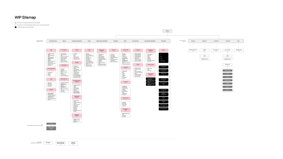
Problem statement
Pandora.net was optimized for efficiency, not inspiration and wasn't showing up digitally like the world’s #1 jewelry brand.
While effective for fast, intent-driven purchases, it no longer reflected our brand’s scale, emotional value, or aspirational positioning. This limited engagement, loyalty, and growth. To become not just the largest, but the most desirable jewelry brand, we launched Project Gemini—a full-scale redesign to evolve Pandora’s digital experience into a global flagship that inspires, converts, and connects.
As the UX lead for the Product Detail Page (PDP)—our most visited and complex page—I played a key role in Project Gemini, a full-scale redesign to align our digital presence with our brand’s in-store excellence and future vision.

Redesigning the Sizing Experience for Confidence and Clarity
An all-in-one flow for fit, guidance, and fulfillment
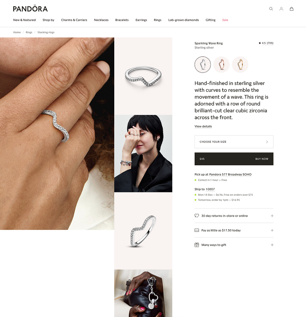
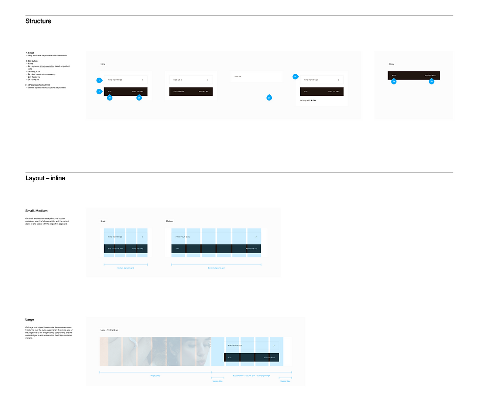
In the legacy PDP, size selectors were exposed inline, with a “Size Guide” anchor link buried in an accordion—making it easy to miss. In the Gemini redesign, we introduced a more guided and informative sizing experience. The new “Find Your Size” flow opens into a dedicated action sheet, where sizes are displayed in a clean vertical list, allowing room for added context, conversion guidance, and selection clarity.
We also embedded the full size guide directly within this flow, making it easier for users to evaluate options without scrolling away. Additionally, if a size is sold out, users are immediately presented with Click & Collect options—offering in-store pickup as a seamless alternative and helping prevent drop-off at a critical decision point.
.png)
The New PLP
PLPs serve the user need to better understand the range of Pandora’s product offering and Pandora as a brand
To better reflect the dual role of PLPs as both entry points and storytelling surfaces, we redesigned the experience into a more structured, emotionally engaging framework. The new Gemini PLP introduces two distinct views – Discover and Shop –supporting both inspiration-led browsing and high-intent shopping. This flexible model balances editorial richness with commercial focus, helping users navigate, explore, and connect more deeply with the brand.
-
Introduced a dual-tab structure: ‘Discover’ for inspiration and storytelling, and ‘Shop’ for product exploration and conversion.
-
Supported growing PLP traffic (50%+ of site visits) by elevating it as a strategic landing experience, not just a filterable grid.
-
Integrated brand voice, visuals, and educational content to establish emotional relevance early in the journey.
-
Preserved conversion pathways while enabling lookbooks, cross-category styling, and holiday or seasonal storytelling.
-
Built flexibility into the framework – different product categories can dial up or down the storytelling vs. commercial balance.

Data Behind This Redesign
While Pandora.net excelled at converting users with high purchase intent, behavioral and industry data revealed critical gaps in engagement, exploration, and emotional connection:
-
70% of jewelry purchase decisions are made during the inspiration phase — yet our site was optimized for speed, not storytelling.
-
1/3 of customers cited the website as the #1 influence on their jewelry purchase — underscoring its role beyond transactions.
-
The longer a customer spends on-site, the higher their average order value — but time-on-site was declining due to limited inspiration and discovery tools.
-
Bounce and abandonment rates signaled frustration among casual browsers, who couldn’t easily explore or feel connected to the brand.
-
Internal usability tests and heatmaps revealed low engagement with static imagery and dense content — and a clear drop-off when customers sought gifting guidance or product education.

01
Role & Responsibilities
As the UX Lead for the Product Detail Page (PDP) — the most visited and commercially impactful part of the site — I played a key role in shaping the direction, strategy, and execution of Pandora’s digital transformation.
My Core Responsibilities:
-
Defined UX strategy for the PDP and adjacent journeys (e.g., gifting, product comparison, discovery flows)
-
Led cross-functional collaboration with visual design, content, research, product, and development teams
-
Synthesized research and data insights into actionable design direction and product opportunities
-
Created wireframes, flows, and prototypes to explore concepts, test hypotheses, and communicate vision
-
Partnered with global stakeholders to align design decisions with business objectives, brand standards, and regional market needs
-
Advocated for the user, ensuring we designed for both inspiration and conversion across all device types
-
Contributed to the broader design system, helping evolve interaction patterns and visual components at scale
Project Gemini was a collaborative, global initiative — but the PDP became a focal point for driving both emotional storytelling and conversion. My role was to ensure those goals didn’t conflict — they complemented one another.

02
Setting the Design Goals & Success Metrics
With clear gaps in engagement, exploration, and emotional connection, we translated our insights into focused design objectives and measurable KPIs. The goal was not just to modernize the platform, but to elevate it — shifting Pandora’s digital experience toward deeper storytelling, emotional relevance, and long-term brand desirability.
This work is a cornerstone of Project Gemini and Pandora’s broader Phoenix strategy — driving transformation through experience innovation, commerce acceleration, and future-ready design.
Key KPIs:
-
Increase brand desirability → Engagement metrics (time on site, repeat visits, interactions per session)
-
Boost product exploration → PDP views per session, cross-category browsing
-
Enhance ease of purchase → Lower bounce and cart abandonment rates; higher conversion
-
Grow gifting and personalization engagement → Increased usage of tools like sizing, engraving, and bundling
-
Support omnichannel growth → Track online-to-offline influence and first-time account sign-ups
03
Discovery
To guide such a significant redesign, we began with a deep and collaborative discovery process — combining qualitative and quantitative inputs to fully understand customer needs, business goals, and experience gaps.
Our goal was to uncover what was working, what wasn’t, and what opportunities we had to deliver a more inspiring, emotionally engaging digital journey.
Key Activities:
-
Competitive & Comparative Analysis
We audited best-in-class e-commerce and DTC brands (e.g., Mejuri, Glossier, Apple) to identify inspiration-led flows, gifting UX, and product storytelling patterns. -
Heuristic & Experience Audit
Evaluated Pandora.net using UX heuristics to identify usability gaps, content density issues, and missed opportunities in product discovery and personalization. -
Behavioral & Analytics Deep Dive
Partnered with data teams to analyze bounce rates, pathing, engagement drop-offs, and PDP performance across devices and regions. -
User Interviews & Testing
Conducted moderated interviews and usability testing with new and returning customers to understand their mindset while shopping for jewelry online. -
Stakeholder & Internal Team Interviews
Engaged global e-commerce, retail, and brand teams to align around market-specific pain points and future growth priorities. -
Voice of the Customer
Mined support feedback and NPS data for recurring friction points related to gifting, sizing, and PDP clarity.

04
Unwrapping the Experience: Information Architecture & Journey Mapping
Following discovery, we shifted focus to understanding and redefining how users moved through Pandora’s digital ecosystem. We approached this by deconstructing the current site architecture and identifying where it broke down in supporting exploration, storytelling, and conversion.
What We Found:
-
The site structure was catalog-first, not customer-first — prioritizing product hierarchy over real user intent.
-
Key flows like gifting, styling, and personalization were fragmented, buried, or disconnected from the shopping journey.
-
Redundant or legacy pages added noise, leading to user confusion and increased bounce.
-
The PDP acted as a bottleneck — overly dense, not modular, and too reliant on imagery that didn’t inspire or educate.
05
My focus on the PDP: Finding Design Opportunities
Through a modular audit of the PDP, we identified both strong foundations and clear friction points across content, interaction, and presentation. While swipe gestures, accordions, and compatibility highlights were performing well, we uncovered opportunities to improve clarity, storytelling, and inspiration across the experience. These insights helped us reframe pain points into design opportunities.
Key Opportunities Identified:
-
Reduce cognitive load by simplifying complex gifting and payment options
-
Enhance representation with diverse models, on-skin views, and styling variations
-
Improve product storytelling by integrating craft, materials, and brand voice
-
Rethink compatibility with more intuitive personalization and pairing tools
-
Simplify reviews with expandable summaries and less visual dominance
-
Encourage bundling and gifting through modular add-ons and collection logic
-
Refine image interactions to reduce friction and redundant UI elements on mobile
These insights shaped early design concepts and prioritization for the new PDP experience — moving from transactional to inspired, without sacrificing clarity or usability.
.png)
06
Translating Insights Into Design
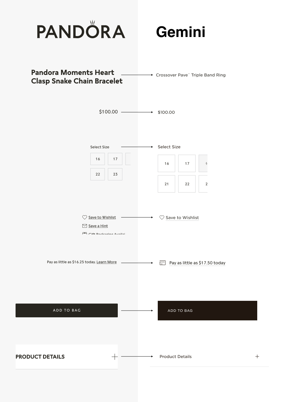
With a clear understanding of user needs, behavioral data, and structural gaps, we moved into high-fidelity design to begin shaping a more emotionally resonant and commerce-driven PDP. I created early design concepts that prioritized visual storytelling, modularity, and clarity — all while working within the emerging design system.
We retained certain proven patterns — like accordions for secondary information — to support a phased approach. However, even in this early version, we started exploring ways to elevate the visual hierarchy, reduce redundancy, and bring richer brand moments into the layout.
Deep dive
Iterations
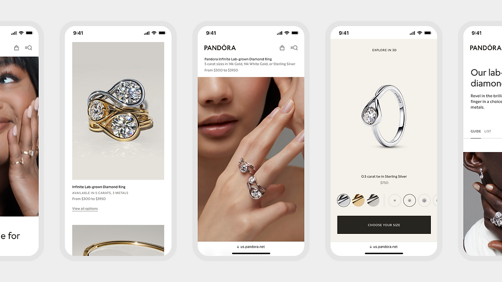
The PDP went through several key iterations aimed at improving clarity, emotional engagement, and decision confidence. Early versions were functionally dense, with disconnected size selectors, educational content, and competing calls to action. Through user testing and UX refinement, we transitioned to a more immersive, mobile-optimized layout that prioritized storytelling, simplified the purchase path, and unified fragmented elements—like size selection and guides—into a single, focused experience. These changes collectively reduced friction and better aligned with modern shopping behaviors.


07
Evolving the Design System
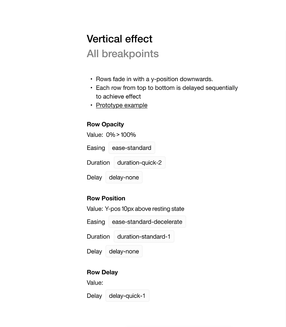
As we explored high-fidelity concepts, it became clear that existing design tokens and patterns needed to expand. We used the PDP as a testbed to introduce modularity, scale storytelling, and refine spacing, typography, and component logic across breakpoints.

NOTE
Tokens & Modularity
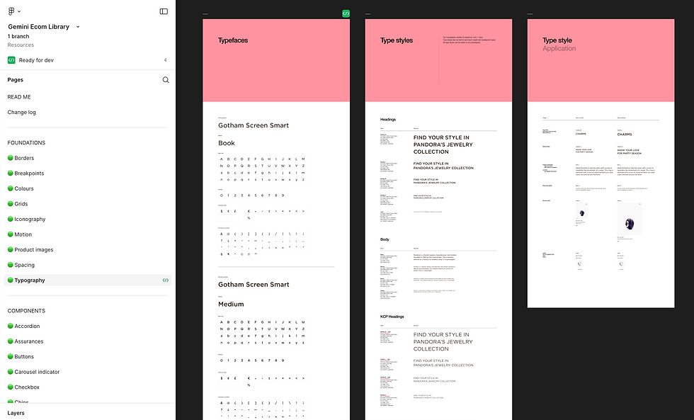
To ensure consistency, scalability, and dev-friendly handoff, we adopted a tokenized design system approach. Every element — from spacing and typography to animation timing and easing — was defined using standardized tokens. This allowed us to rapidly iterate while maintaining alignment across breakpoints, modules, and regions.
Key Benefits of Tokenization:
-
Consistency at scale → UI behaviors and transitions remain predictable across the experience
-
Developer efficiency → Tokens act as shared variables between design and code, reducing ambiguity and rework
-
Theming and flexibility → Easy to localize, brand, or update without disrupting the core system
-
Accessibility & motion control → Animation tokens (like duration-quick-2, ease-standard) enable thoughtful defaults while respecting performance and user needs
08
Micro-interactions: Subtle, But Intentional
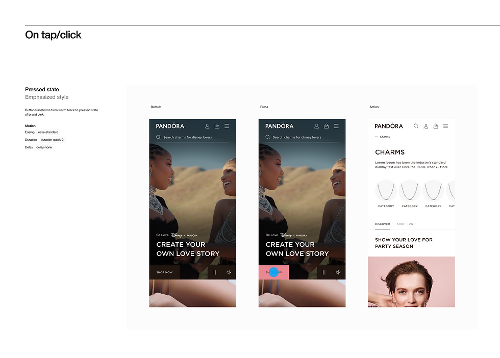
We incorporated a layer of microinteractions — brief, polished animations that respond to user actions. From hover states on CTAs like “Shop Now” to soft fades and transitions across modules, these moments added tactile feedback, brand polish, and perceived responsiveness without being distracting.

09
Bridging the Gap Between Design and Dev
To ensure a seamless handoff and reduce ambiguity, we documented motion and interaction behavior with the same precision as static layout. Every interaction — like the “Shop Now” button — was annotated with token-based specs (e.g., easing, delay, duration) using a shared system familiar to developers.
This made behaviors not only consistent and scalable, but also easily translatable to production. Developers didn’t need to interpret intent — they had clear, aligned parameters they could build from confidently.
This level of design maturity helped streamline build cycles and reinforced our commitment to systematized, implementation-ready design.
10
User Testing & Validation
To ensure our redesign direction aligned with real customer expectations, we conducted a mix of moderated interviews and unmoderated usability tests across key product and content areas — including the PDP and PLP. These sessions helped us validate design choices, identify moments of confusion, and uncover unmet user needs.
Key insights from testing:
-
Users wanted more contextual imagery — like product-on-skin views and lifestyle photos — to better evaluate items without switching pages.
-
Content clarity mattered — participants frequently cited long, overly styled descriptions and inconsistent review placements as distracting or “too salesy.”
-
Visual consistency and feedback played a major role in perceived quality — microinteractions, load behavior, and media transitions were directly associated with brand trust.
These findings helped us refine content hierarchy, image strategy, and interaction patterns — ultimately ensuring our designs felt both premium and purposeful.
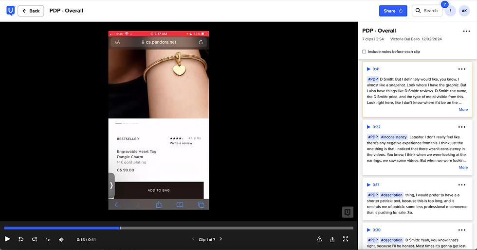


11
Live Design
Displayed below are screen recordings showcasing the live design in action, offering insights into both desktop and mobile views. These recordings provide a tangible demonstration of the seamless transition between the meticulously crafted design mocks discussed earlier and the successful implementation on the live site. The user journey unfolds effortlessly across various devices, highlighting the careful consideration given to responsive design and ensuring a consistent and intuitive experience for users. It's worth noting that this impactful design transformation has positively influenced millions of live users worldwide, solidifying its significance in enhancing the overall user experience on a global scale.


12
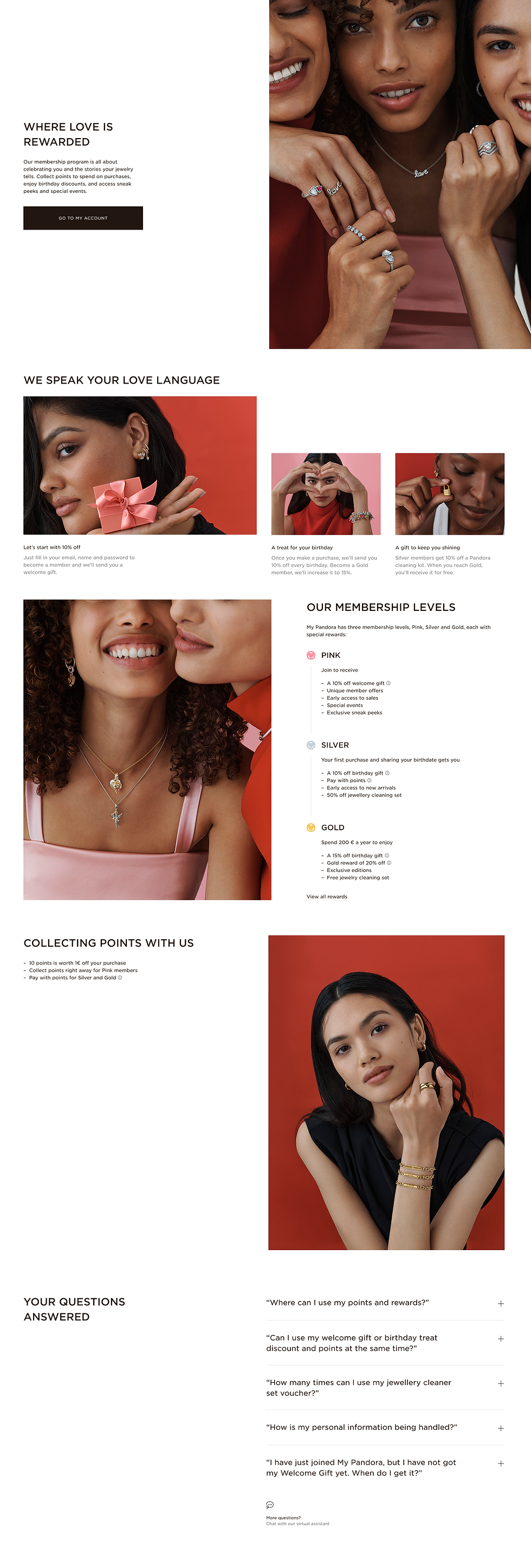
Loyalty
The evolving customer expectations and loyalty behaviors, we moved into high-fidelity design to reimagine Pandora’s loyalty experience — transforming it from a transactional program into a relationship-building journey. I created early concepts that emphasized clarity, personalization, and emotional value, while aligning with the broader design system.
We preserved key mechanics — such as tier progression and points tracking — to ensure familiarity, but introduced new visual patterns and messaging to reinforce the feeling of recognition and exclusivity.
This direction became the foundation for future refinements — including more tailored content modules, a restructured benefits overview, and deeper integration across the site to surface loyalty status and incentives contextually.


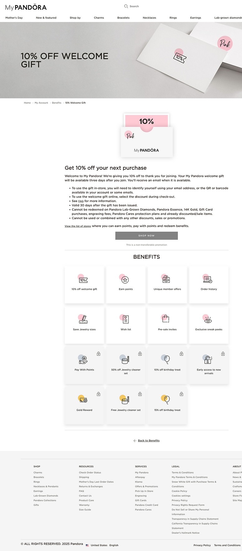
Old design
Compared to Legacy Design
The previous loyalty experience was functional but lacked emotional resonance. It presented benefits and point balances in a rigid, text-heavy format, with limited visual hierarchy and minimal brand storytelling.
Key information like tier progression, rewards, and how to earn points was often buried or unclear, leading to low engagement and limited user understanding of the program’s full value. The experience felt disconnected from Pandora’s brand — more like a utility dashboard than a celebration of loyalty.


13
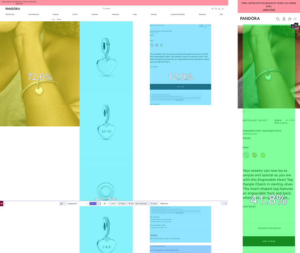
Post-Launch Performance Monitoring
To ensure the redesigned experience delivered both business and user value, we launched with a phased A/B rollout strategy — starting at 10% exposure in Canada and Italy, then gradually increasing to 30%, before fully rolling out the new experience across markets (Q4 2024 - Q1 2025).
We monitored key user behaviors through a combination of quantitative and behavioral analytics tools:
Adobe Analytics – for tracking user flows, conversion rates, and feature usage across devices and journeys
ContentSquare – for granular behavioral insights like exposure rate, scroll depth, hesitation, and click recurrence.
By layering these tools, we continuously validate design effectiveness and inform future iteration strategies with real user behavior.
14
The Impact
The Gemini redesign marked a complete transformation of Pandora’s digital experience — shifting from a transactional platform to a dynamic, emotionally resonant ecosystem. By rearchitecting journeys, embracing modular design systems, and embedding storytelling throughout the experience, we aligned the interface with both user behavior and business intent. The result: improved discoverability, higher engagement, and increased conversion — all while strengthening brand perception and customer satisfaction. Gemini not only modernized the platform but created a scalable foundation for continuous optimization, personalization, and growth.
